

This is a story all about how my blog got flipped–turned upside down: I have a post, with something I hope will be interesting (I’ve been working on it for a while.) Despite that, though, this will be a quick read as I have been quite busy. (I don’t know how greenpawn does it.)
I have been working to develop a visualization on how different chess players approach the game. To this end, here is an example demonstrating the different play styles of Karjakin and Carlsen.
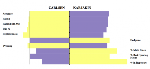
(I'm sorry. I've tried, and I can't make it bigger. I know, I know.)
I think that some interesting things can be measured from this graph:
1. Carlsen experiments much more in the opening, playing more unpopular moves, and a greater variety of openings. Despite this, though, the win% of his moves is very similar.
2. Carlsen is better across the board than Karjakin, by fairly significant amounts, particularly in rating.
3. I’m not actually sure how much criterion #6 can be trusted, but based on this Karjakin would be slightly better in endgames. Just a thought.
These were my criteria for the different characteristics:
1. Top-line Stockfish match % (chess-db)
2. Rating average in Dec last three years (fide)
3. Average of rapid and blitz ratings (fide)
4. Chessgames win %
5. % of “winning sacrifices” played in games with chessgames sacrifice explorer
6. chess-db optimal play in the endgame
7. Median draw move chess-db
8. For five moves into four most played openings for white and black, record (in twenty most recent games) % played most popular move (chessgames.com)
9. For five moves into four most played openings for white and black, record (in twenty most recent games) record win % of highest-played move in Master games (where wins count for 1 and draws count for 0.5) (chessgames.com)
10. % played four most popular openings (chessgames.com)
And here are links to spreadsheets I used to compile the data, if you all are interested:
https://docs.google.com/spreadsheets/d/13ImiJH7DMZEoif81P992WzWwxxzlB92qeBDs50TtC3g/view#gid=0
https://docs.google.com/spreadsheets/d/1Sx3H1WQz3vfkqggZ3ufjvX6WDsV3pKLv3C52XJXlZok/view#gid=0
Given that these values all are on different scales (for instance, a rating average is much larger than a percentage,) I compared the results player to player, recording how much they deviated from the average between both players, and creating the graph based on this. (Because of that, sadly, these graphs are non-transitive; they shouldn’t be used to compare multiple players at once.)
I think that though this is certainly imperfect, some interesting things can be measured from graphs in this format. Once I collect enough data, (perhaps 10-20 players,) I would like to create radar graphs using similar characteristics, such as those used in more traditional sports. I have one concern, though: although these graphs may be entertaining, they might not be useful for anything besides, such as evaluating which players are better in certain areas.
Please let me know what you think in the discussion thread: Thread 171420
As always, thanks for reading,
Hikaru
